Wrong or no access token.
DUJE JURIĆ
Since earning his MA in 2012 in Zagreb, Croatia, he has worked as a graphic designer and art director, gaining valuable experience in branding and advertising agencies such as Grey Worldwide Zagreb, Bruketa&Žinić&Grey, Švicarska, and Saatchi&Saatchi. His roles have involved creating and maintaining visual aesthetics aligned with concepts, crafting visual narratives and identities, providing art direction on sets, animating motion graphics, and editing videos. Founding Studio Dosada has allowed him to explore creative growth, focusing on art concepts, brand strategy, and visual identity systems.
He currently works as an Art Director at Warner Bros. Discovery (Max – streaming platform) where he is overseeing brand standards for Max across EMEA, creating master files and design guidelines to ensure consistency across platforms. Leading key art for Local Original Productions, merging global branding with regional creative strategies. Driving creative 360 campaigns, from concept to execution, and managing updates to templates and brand standards to strengthen visual identity across markets.
Also, he is running Studio Dosada (studio boredom), where he works on both commercial and non-commercial projects, specializing in art direction and branding.
He now resides in Smørum, near Copenhagen, Denmark.
This page showcases a curated selection of his most relevant projects, presented in a streamlined, easy-to-navigate format.
Note: This page is exclusive and hidden from the rest of the Studio's website.
BRAND STRATEGY AND IDENTITY FOR SABANT
BRAND STRATEGY AND IDENTITY FOR SABANT
BRAND STRATEGY AND IDENTITY FOR SABANT
BRAND STRATEGY AND IDENTITY FOR SABANT
BRAND STRATEGY AND IDENTITY FOR SABANT
The project involved developing a full brand strategy for Sabant — including naming, brand story, and visual identity. Sabant’s identity centers on a rotated “S” that symbolizes the circular process of turning alcohol industry waste into plant-based leather. This subtle yet powerful shift reflects innovation, sustainability, and a new resource lifecycle. The system includes three sublogos inspired by chemical elements and drink coasters, representing each leather type. A bold color palette and minimalist design ensure brand consistency, while natural lighting and clean typography emphasize authenticity and elegance.
MAX PRIDE CAMPAIGN 2024
MAX PRIDE CAMPAIGN 2024
MAX PRIDE CAMPAIGN 2024
MAX PRIDE CAMPAIGN 2024
MAX PRIDE CAMPAIGN 2024
Led the creative direction and design for Max’s 2024 Pride campaign in EMEA, celebrating diversity through bold color, geometric forms, and iconic characters. The visual concept combined vibrant squares with key talent imagery, creating a modular system adaptable across the platform, social media, and digital placements. A unified and joyful expression of identity, visibility, and pride across all digital touchpoints.
KEY ART DESIGN DIRECTION
KEY ART DESIGN DIRECTION
KEY ART DESIGN DIRECTION
KEY ART DESIGN DIRECTION
KEY ART DESIGN DIRECTION
Art direction, design, and creative strategy for a collection of key art pieces created for Max (ex HBO Max) Local Original Productions across Europe. Each artwork was developed through strategic and visual adaptation tailored to its specific market—balancing local storytelling with global brand alignment. From initial concept to final design, I led the creative process to ensure each piece resonated culturally while maintaining a unified visual language across the region..
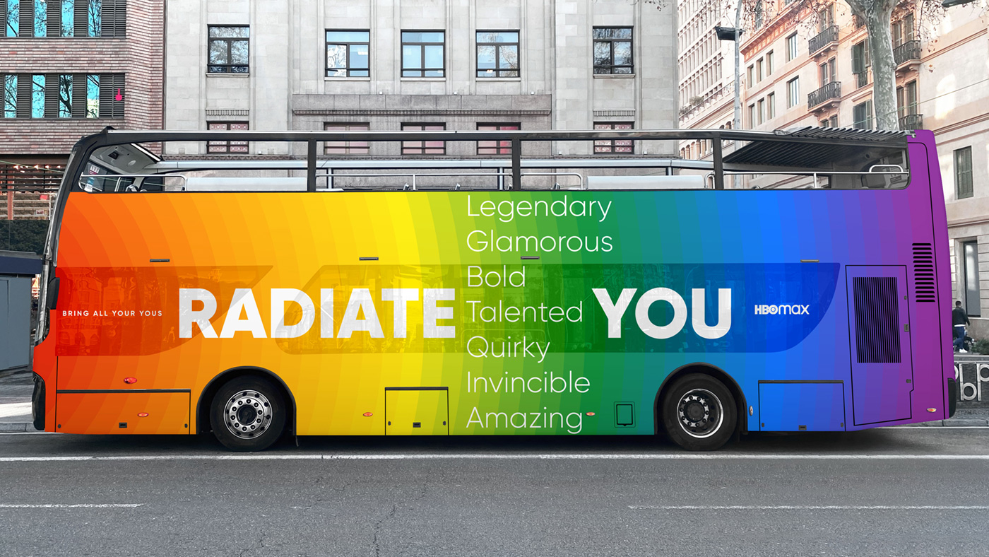
HBO Max PRIDE 2022
HBO Max PRIDE 2022
HBO Max PRIDE 2022
HBO Max PRIDE 2022
Proposition for 2022 Pride Campaign that would be active during Pride Month in Spain and Europe. Insight is that self-confident people radiate with their presence and influence others in their surroundings. Inserting a bunch of positive adverbs (starting with the letters LGTBQIA) between RADIATE _ YOU, we get a huge variety of messages that celebrate all our differences. They encourage us to feel more comfortable in our own skin, and hopefully to the extent that we influence our surrounding with our presence.
Proposition for 2022 Pride Campaign that would be active during Pride Month in Spain and Europe. Insight is that self-confident people radiate with their presence and influence others in their surroundings. Inserting a bunch of positive adverbs (starting with the letters LGTBQIA) between RADIATE _ YOU, we get a huge variety of messages that celebrate all our differences. They encourage us to feel more comfortable in our own skin, and hopefully to the extent that we influence our surrounding with our presence.
Proposition for 2022 Pride Campaign that would be active during Pride Month in Spain and Europe. Insight is that self-confident people radiate with their presence and influence others in their surroundings. Inserting a bunch of positive adverbs (starting with the letters LGTBQIA) between RADIATE _ YOU, we get a huge variety of messages that celebrate all our differences. They encourage us to feel more comfortable in our own skin, and hopefully to the extent that we influence our surrounding with our presence.


ART DIRECTION FOR VARIOUS HBO Max PRESENTATION DECKS
ART DIRECTION FOR VARIOUS
HBO Max PRESENTATION DECKS
ART DIRECTION FOR VARIOUS
HBO Max PRESENTATION DECKS
ART DIRECTION FOR VARIOUS HBO Max PRESENTATION DECKS
Presentation decks for different purposes are in great need of a specific design direction. By using a wide range of digital and analog tools different covers and presentation materials are created having in mind communications requirements, audience, and content.
Presentation decks for different purposes are in great need of a specific design direction. By using a wide range of digital and analog tools different covers and presentation materials are created having in mind communications requirements, audience, and content.
Presentation decks for different purposes are in great need of a specific design direction. By using a wide range of digital and analog tools different covers and presentation materials are created having in mind communications requirements, audience, and content.
Presentation decks for different purposes are in great need of a specific design direction. By using a wide range of digital and analog tools different covers and presentation materials are created having in mind communications requirements, audience, and content.
Presentation decks for different purposes are in great need of a specific design direction. By using a wide range of digital and analog tools different covers and presentation materials are created having in mind communications requirements, audience, and content.


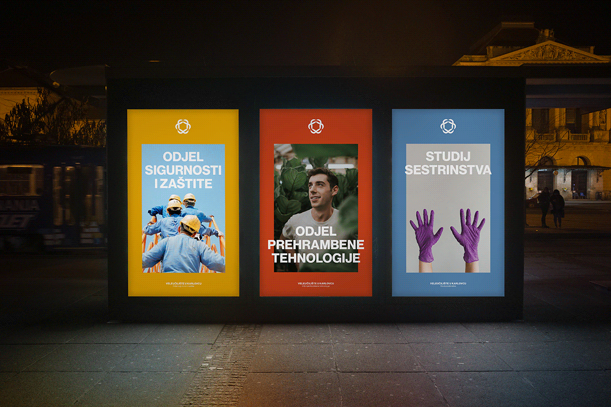
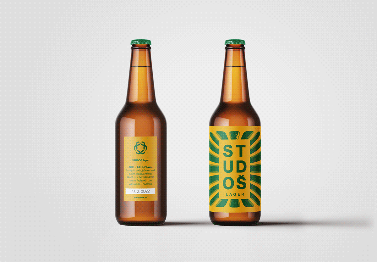
BRANDING OF KARLOVAC UNIVERSITY OF APPLIED SCIENCES
BRANDING OF KARLOVAC UNIVERSITY OF APPLIED SCIENCES
BRANDING OF KARLOVAC UNIVERSITY OF APPLIED SCIENCES
The intertwined symbol in a shape of a six-point star is a metaphor for the everyday work philosophy of the University where students, community, and economy are combined and interact with one goal, mutual prosperity.
The intertwined symbol in a shape of a six-point star is a metaphor for the everyday work philosophy of the University where students, community, and the economy are combined and interact with one goal, mutual prosperity.
The intertwined symbol in a shape of a six-point star is a metaphor for the everyday work philosophy of the University where students, community, and the economy are combined and interact with one goal, mutual prosperity.
The intertwined symbol in a shape of a six-point star is a metaphor for the everyday work philosophy of the University where students, community, and the economy are combined and interact with one goal, mutual prosperity.


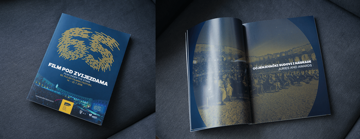
65. PULA FILM FESTIVAL
65. PULA FILM FESTIVAL
65. PULA FILM FESTIVAL
65. PULA FILM FESTIVAL
65. PULA FILM FESTIVAL
Visual identity for the 65. Pula Film Festival was inspired by the trails of the stars that are left on the sky by the Earth's rotation (astrophotography). As the main claim of the festival is "Film under the stars" this identity key element is a number 65 made of star trails in the sky.
Visual identity for the 65. Pula Film Festival was inspired by the trails of the stars that are left on the sky by the Earth's rotation (astrophotography). As the main claim of the festival is "Film under the stars" this identity key element is a number 65 made of star trails in the sky.
Visual identity for the 65. Pula Film Festival was inspired by the trails of the stars that are left on the sky by the Earth's rotation (astrophotography). As the main claim of the festival is "Film under the stars" this identity key element is a number 65 made of star trails in the sky.


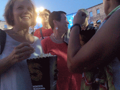
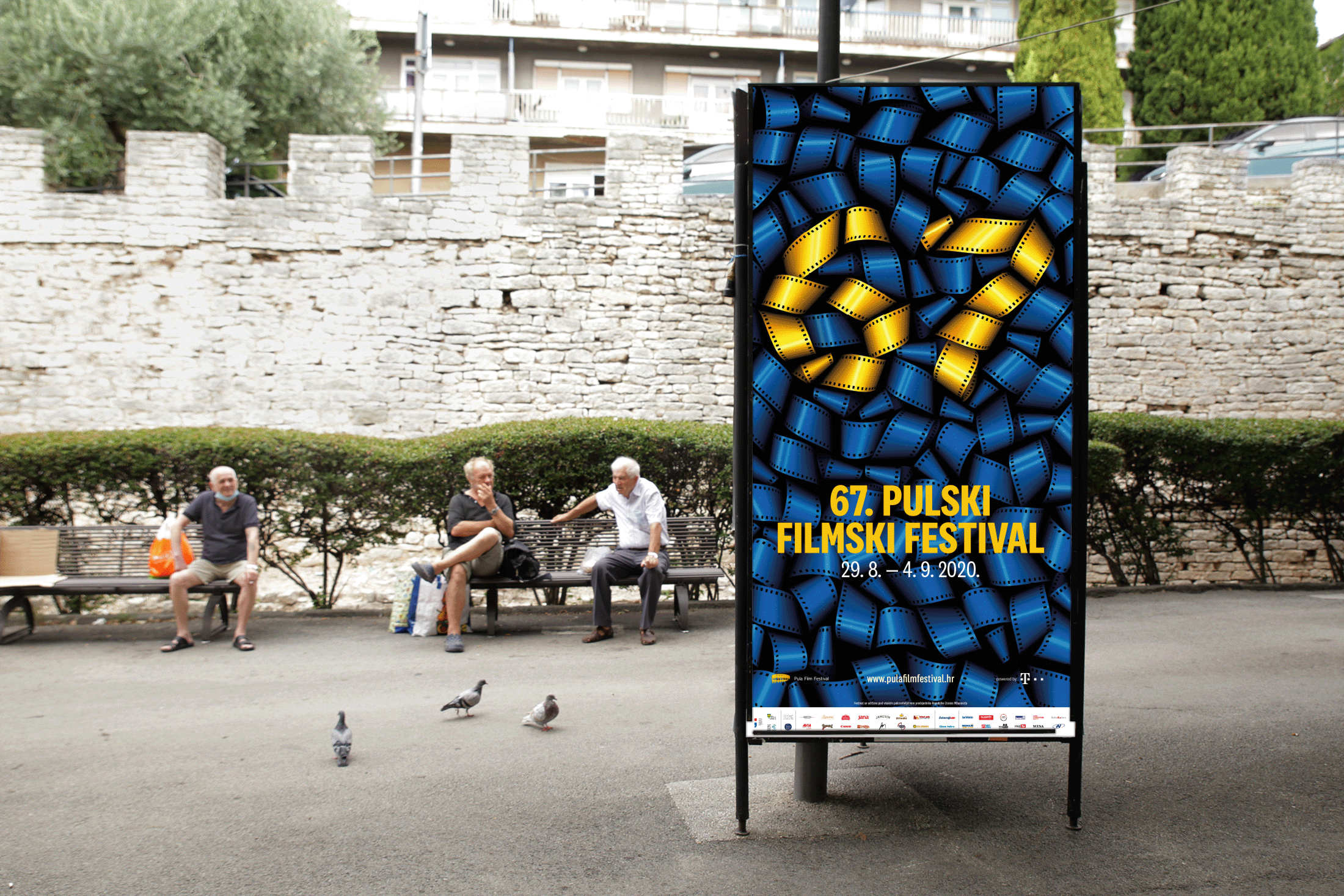
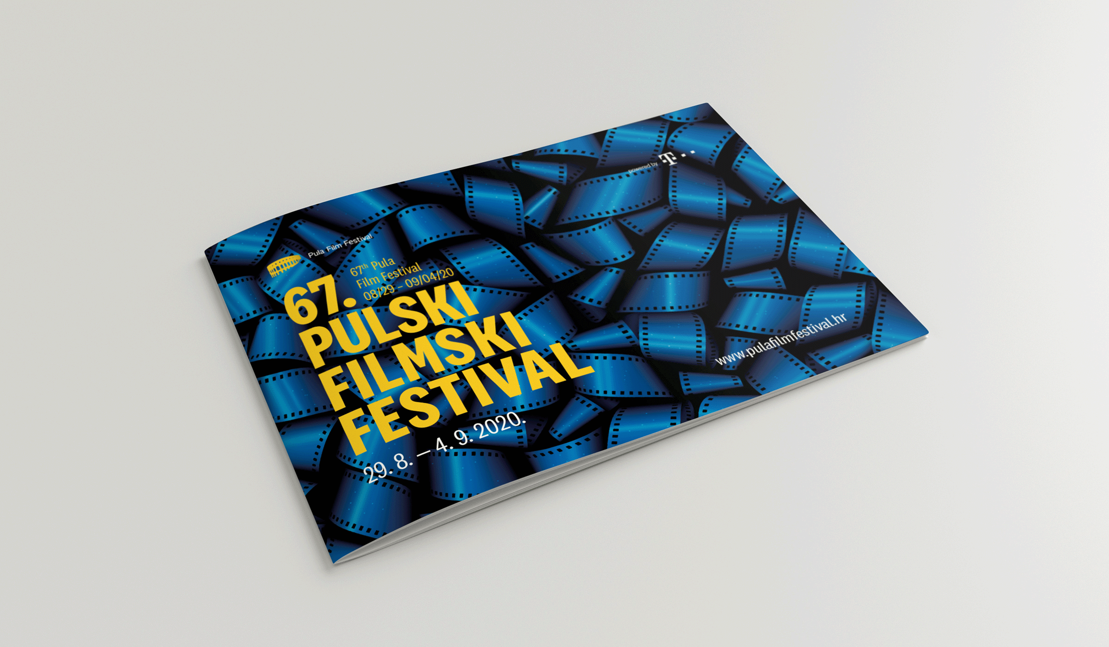
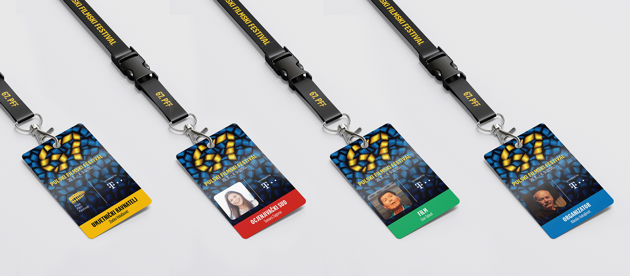
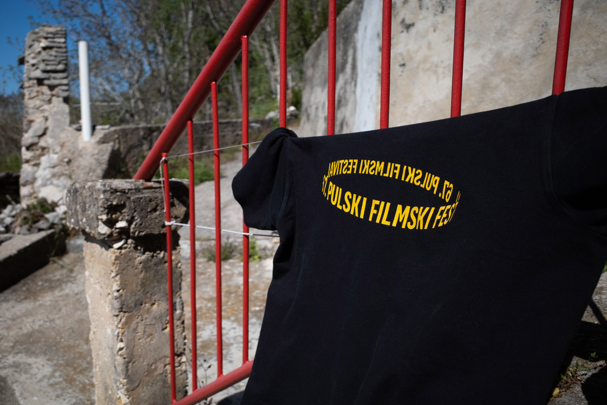
67. PULA FILM FESTIVAL
67. PULA FILM FESTIVAL
67. PULA FILM FESTIVAL
67. PULA FILM FESTIVAL
67. PULA FILM FESTIVAL
This Pula Film Festival's visual identity was inspired by the fact that the whole city is full of film screenings. Every corner of the city is a place where you can watch a movie and every part of the festival's graphic materials are full of film rolls to emphasize the idea.
This Pula Film Festival's visual identity was inspired by the fact that the whole city is full of film screenings. Every corner of the city is a place where you can watch a movie and every part of the festival's graphic materials are full of film rolls to emphasize the idea.
This Pula Film Festival's visual identity was inspired by the fact that the whole city is full of film screenings. Every corner of the city is a place where you can watch a movie and every part of the festival's graphic materials are full of film rolls to emphasize the idea.


68. PULA FILM FESTIVAL
68. PULA FILM FESTIVAL
68. PULA FILM FESTIVAL
68. PULA FILM FESTIVAL
68. PULA FILM FESTIVAL
This identity proposition for 68. Pula Film Festival was inspired by the importance of the shipyard industry for the town of Pula. It was the biggest industry in town and every citizen of Pula had a family member that worked in a shipyard. The shipyard is soon to be closed and this was a perfect opportunity for an hommage to the dying industry that fed the whole town for a century.
This identity proposition for 68. Pula Film Festival was inspired by the importance of the shipyard industry for the town of Pula. It was the biggest industry in town and every citizen of Pula had a family member that worked in a shipyard. The shipyard is soon to be closed and this was a perfect opportunity for an hommage to the dying industry that fed the whole town for a century.
This identity proposition for 68. Pula Film Festival was inspired by the importance of the shipyard industry for the town of Pula. It was the biggest industry in town and every citizen of Pula had a family member that worked in a shipyard. The shipyard is soon to be closed and this was a perfect opportunity for an hommage to the dying industry that fed the whole town for a century.
This identity proposition for 68. Pula Film Festival was inspired by the importance of the shipyard industry for the town of Pula. It was the biggest industry in town and every citizen of Pula had a family member that worked in a shipyard. The shipyard is soon to be closed and this was a perfect opportunity for an hommage to the dying industry that fed the whole town for a century.


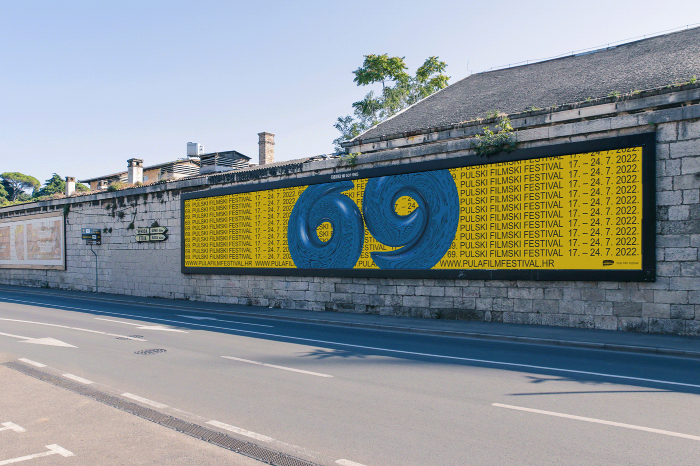
69. PULA FILM FESTIVAL
69. PULA FILM FESTIVAL
69. PULA FILM FESTIVAL
69. PULA FILM FESTIVAL
69. PULA FILM FESTIVAL
Identity proposition for 69. Pula Film Festival is based on reflectivity numbers 6 and 9 seem to have which is an analogy with the actors and their roles in films. Combining Cinema4D with Photoshop and Illustrator, this identity comes to life to stand out and become recognizable and adaptable to all the festival materials.
Identity proposition for 69. Pula Film Festival is based on reflectivity numbers 6 and 9 seem to have which is an analogy with the actors and their roles in films. Combining Cinema4D with Photoshop and Illustrator, this identity comes to life to stand out and become recognizable and adaptable to all the festival materials.
Identity proposition for 69. Pula Film Festival is based on reflectivity numbers 6 and 9 seem to have which is an analogy with the actors and their roles in films. Combining Cinema4D with Photoshop and Illustrator, this identity comes to life to stand out and become recognizable and adaptable to all the festival materials.


EXPLORATION OF RHOTACISM
EXPLORATION OF RHOTACISM
EXPLORATION OF RHOTACISM
EXPLORATION OF RHOTACISM
The best way to deal with rhotacism (a defective pronunciation of R) is to embrace it and use it to explore all the possibilities of making a letter R with different tools, analog or digital.
The best way to deal with rhotacism (a defective pronunciation of R) is to embrace it and use it to explore all the possibilities of making a letter R with different tools, analog or digital.
The best way to deal with rhotacism (a defective pronunciation of R) is to embrace it and use it to explore all the possibilities of making a letter R with different tools, analog or digital.
The best way to deal with rhotacism (a defective pronunciation of R) is to embrace it and use it to explore all the possibilities of making a letter R with different tools, analog or digital.
The best way to deal with rhotacism (a defective pronunciation of R) is to embrace it and use it to explore all the possibilities of making a letter R with different tools, analog or digital.
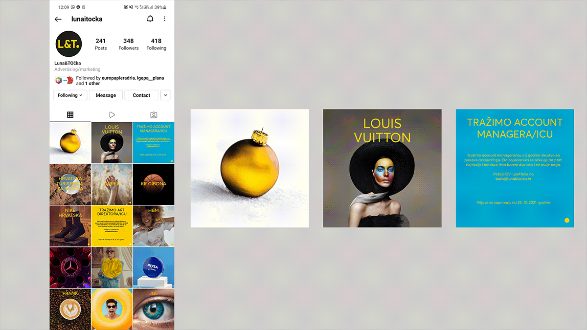
LUNA&TOCKA
LUNA&TOCKA
LUNA&TOCKA
LUNA&TOCKA
LUNA&TOCKA
Art direction of visual identity for an advertising agency Luna&Tocka from Zagreb, Croatia. Pre created logotype needed a little tweak and the dot from it has become a brand element whose purpose was to give identity recognizability and a template for all future assets.
Art direction of visual identity for an advertising agency Luna&Tocka from Zagreb, Croatia. Pre created logotype needed a little tweak and the dot from it has become a brand element whose purpose was to give identity recognizability and a template for all future assets.
Art direction of visual identity for an advertising agency Luna&Tocka from Zagreb, Croatia. Pre created logotype needed a little tweak and the dot from it has become a brand element whose purpose was to give identity recognizability and a template for all future assets.


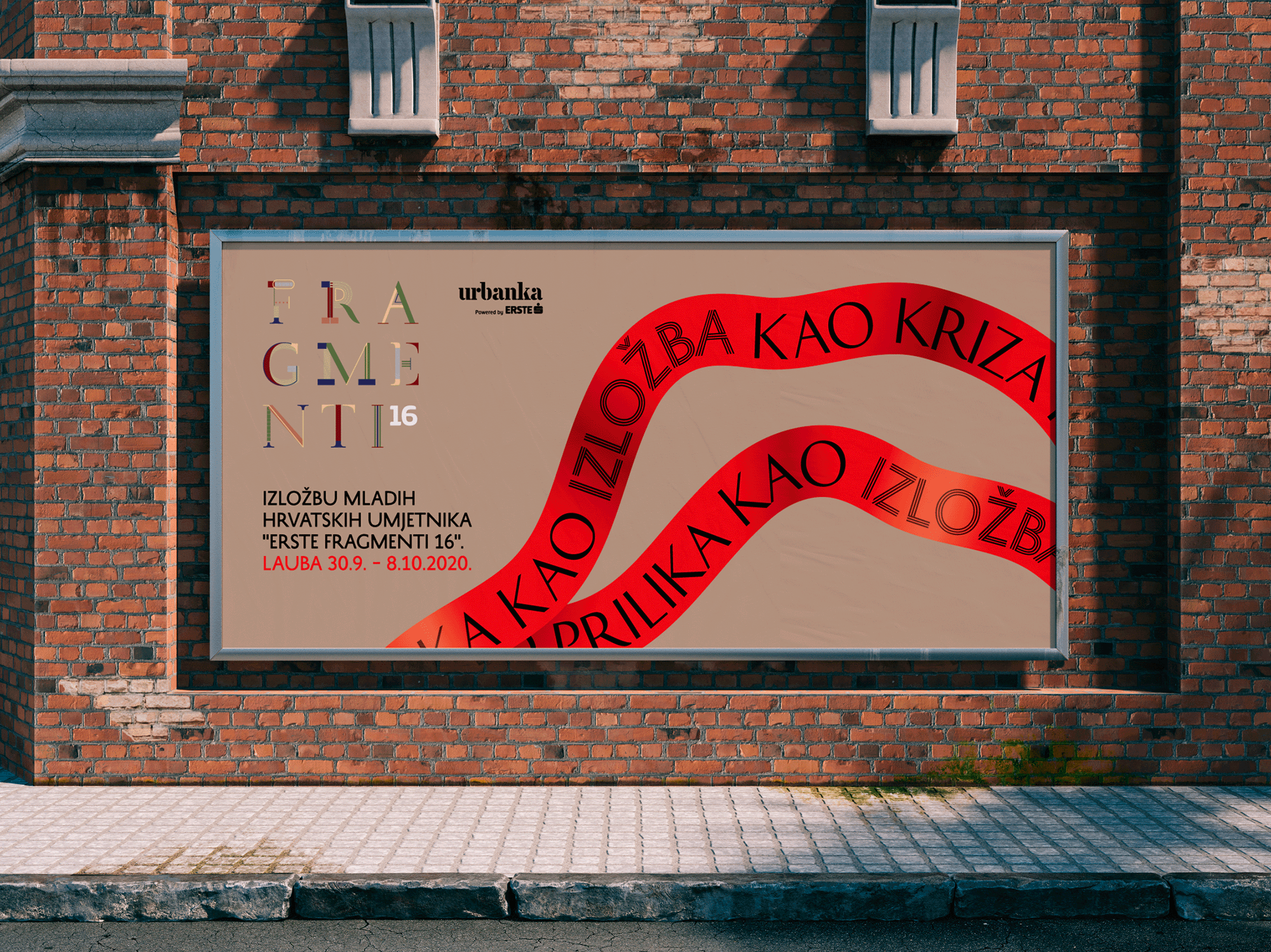
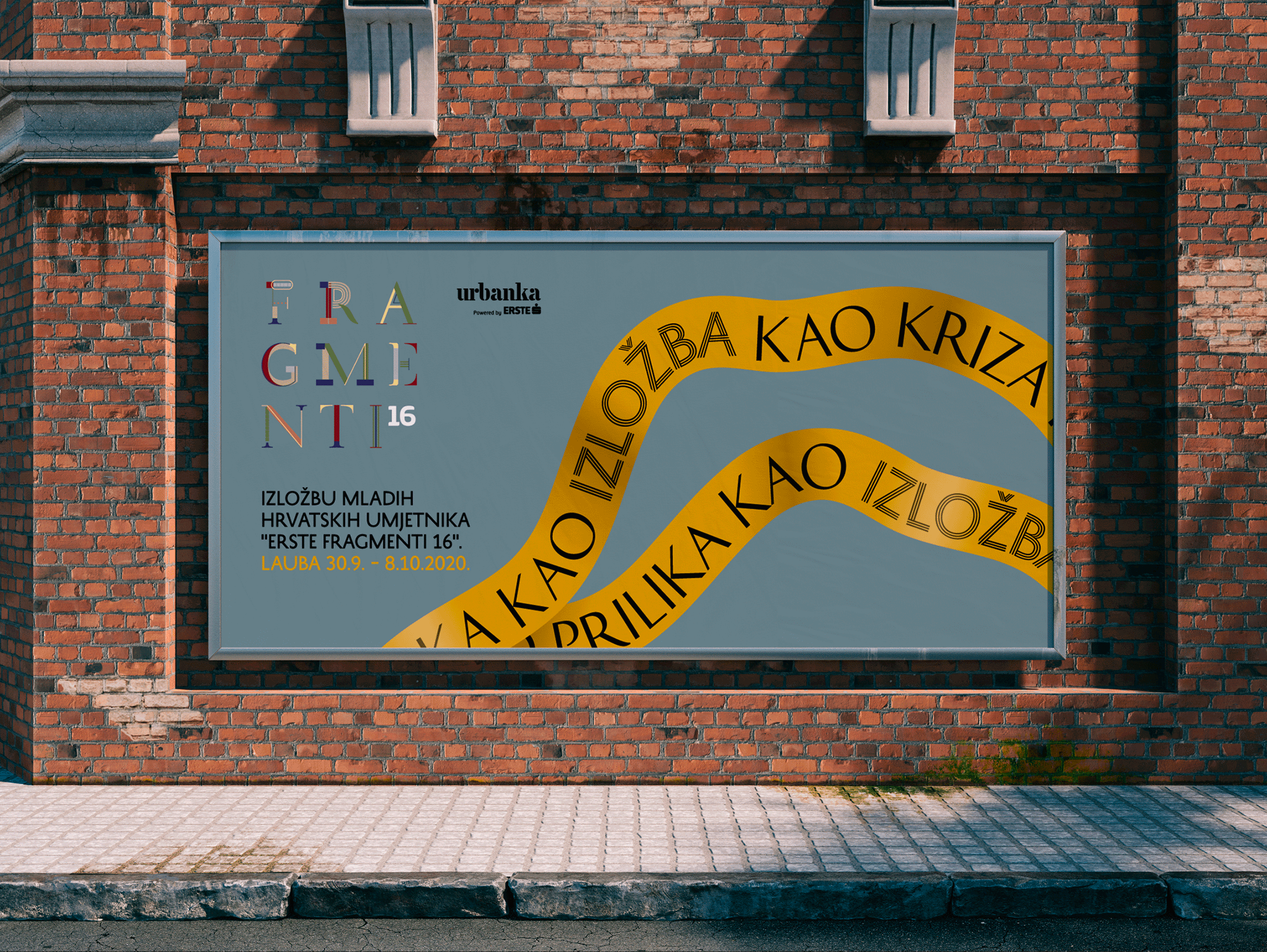
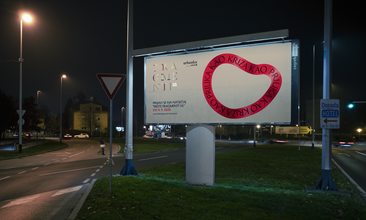
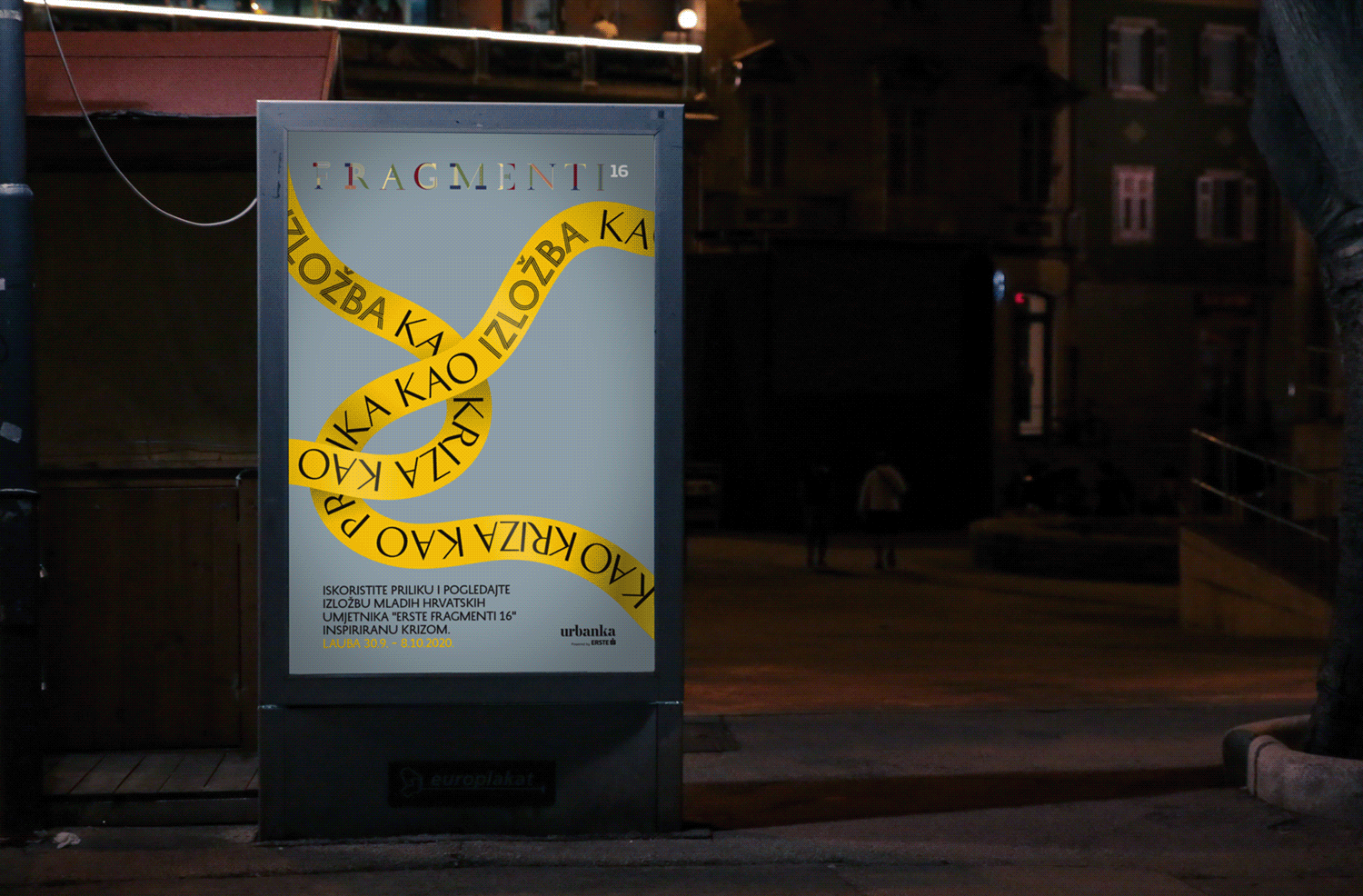
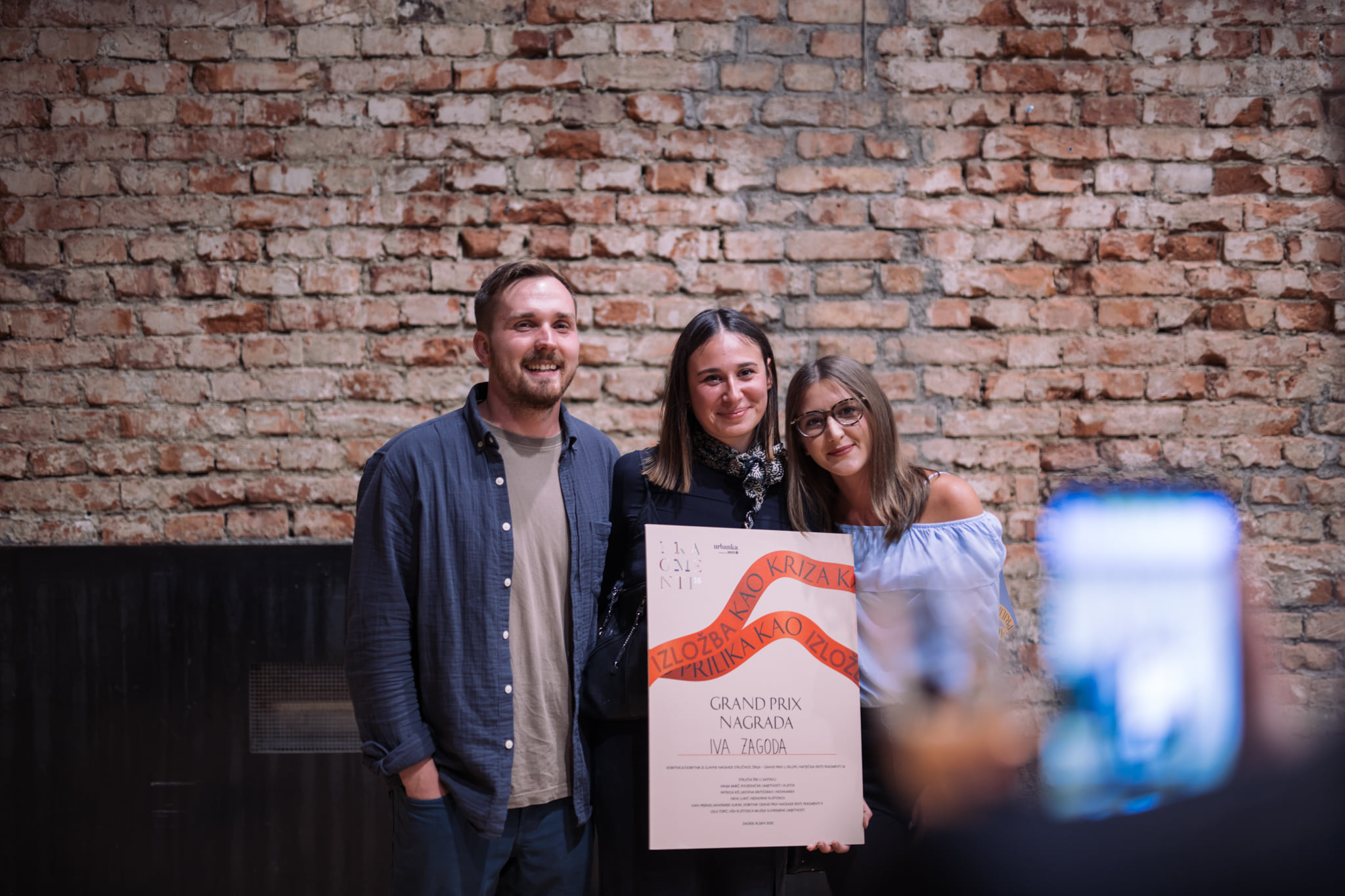
ERSTE FRAGMENTS
ERSTE FRAGMENTS
ERSTE FRAGMENTS
ERSTE FRAGMENTS
ERSTE FRAGMENTS
Art direction and identity for the artistic story built by Erste Fragmenti has a firm determination to provide concrete financial support for the development of art, either by purchasing works or awarding scholarships to students of art academies.
Art direction and identity for the artistic story built by Erste Fragmenti has a firm determination to provide concrete financial support for the development of art, either by purchasing works or awarding scholarships to students of art academies.
Art direction and identity for the artistic story built by Erste Fragmenti has a firm determination to provide concrete financial support for the development of art, either by purchasing works or awarding scholarships to students of art academies.

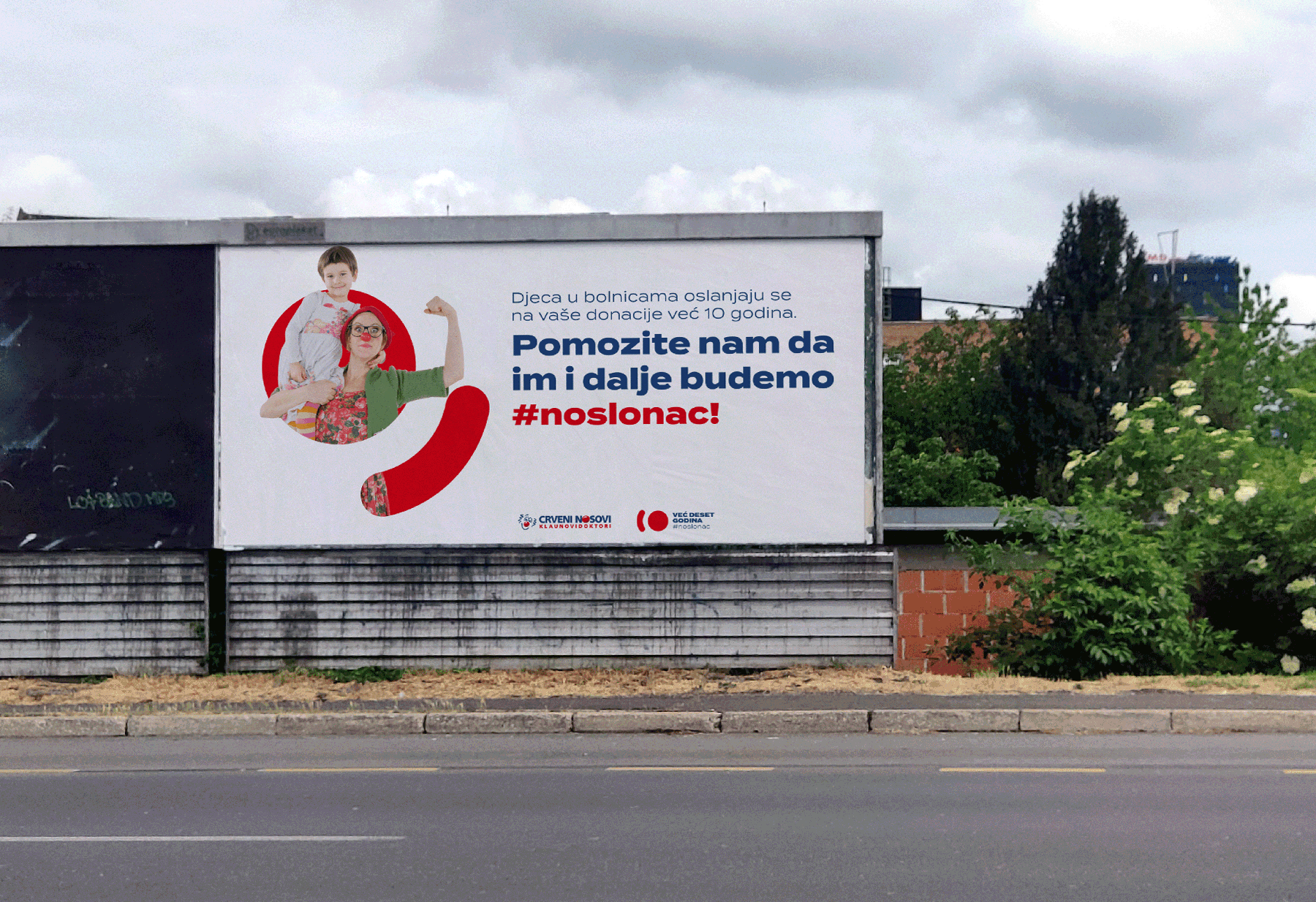
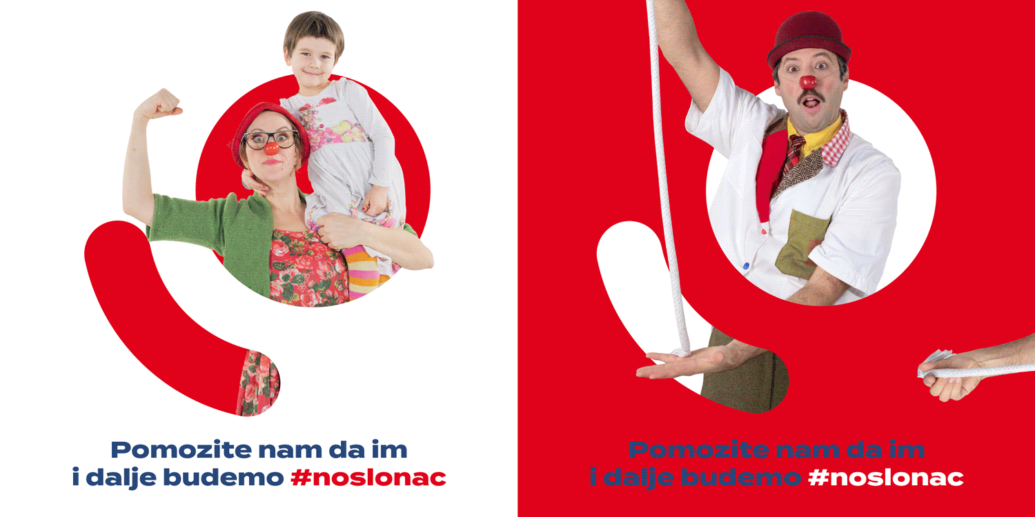
10 YEARS OF CLOWN DOCTORS IN CROATIA
10 YEARS OF CLOWN DOCTORS IN CROATIA
10 YEARS OF CLOWN DOCTORS IN CROATIA
10 YEARS OF CLOWN DOCTORS IN CROATIA
10 YEARS OF CLOWN DOCTORS IN CROATIA
Art direction for the identity of the 10th anniversary of Clown Doctors in Croatia. Clown's nose and a smile are implemented in the number 10 that becomes the key part of every image produced in the campaign.
Art direction for the identity of the 10th anniversary of Clown Doctors in Croatia. Clown's nose and a smile are implemented in the number 10 that becomes the key part of every image produced in the campaign.
Art direction for the identity of the 10th anniversary of Clown Doctors in Croatia. Clown's nose and a smile are implemented in the number 10 that becomes the key part of every image produced in the campaign.


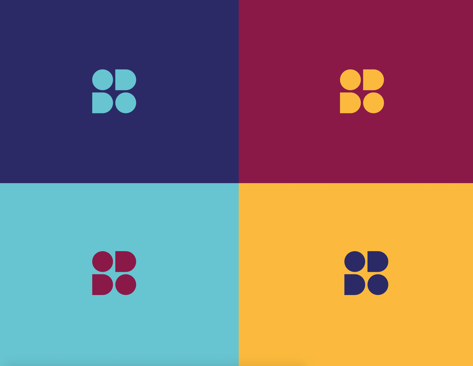
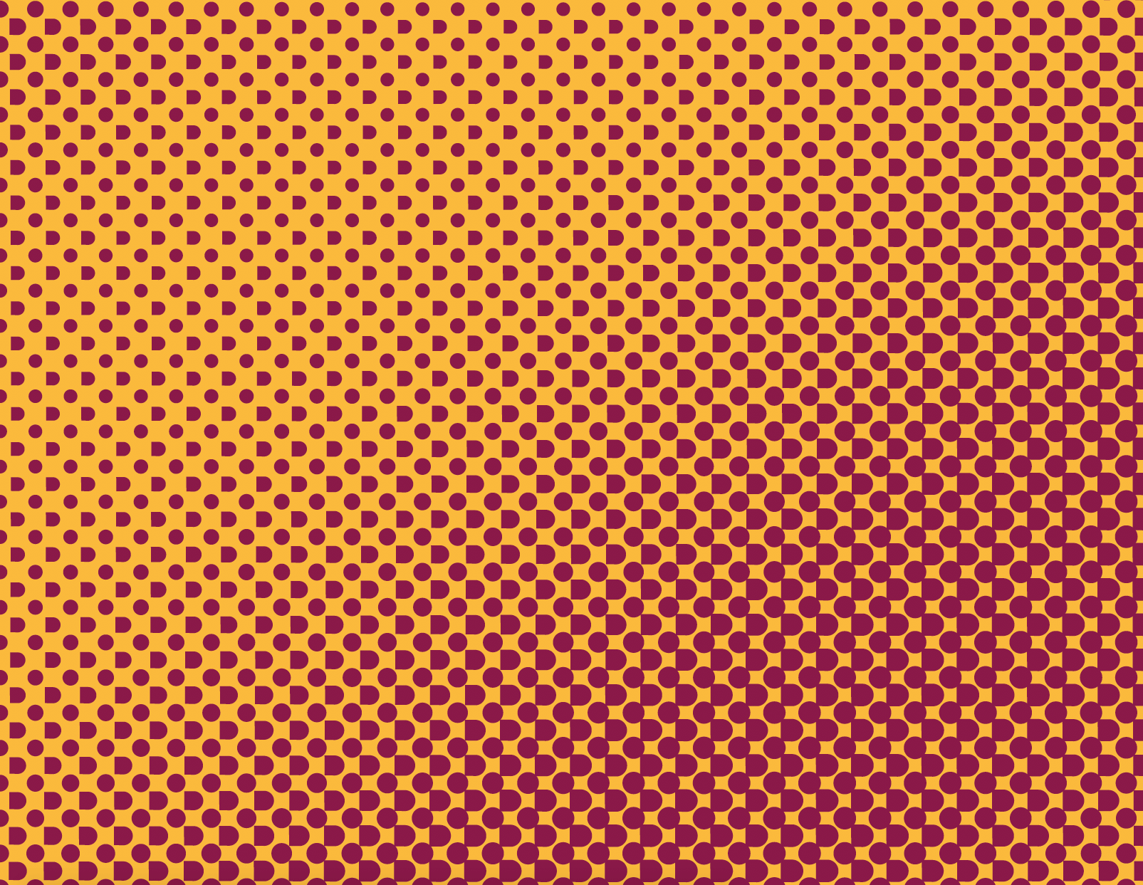
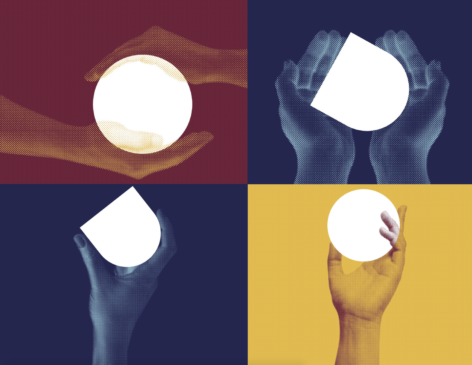
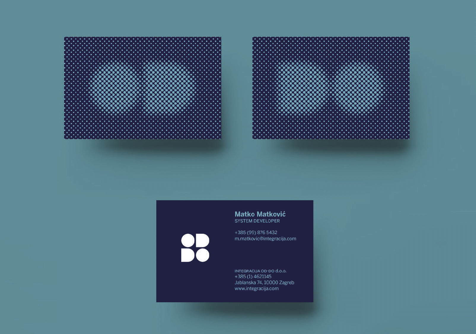
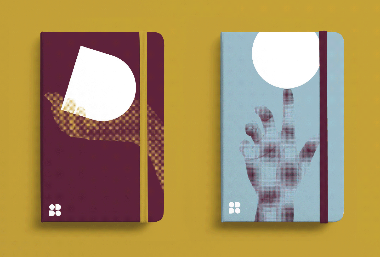
OD DO
OD DO
OD DO
OD DO
OD DO
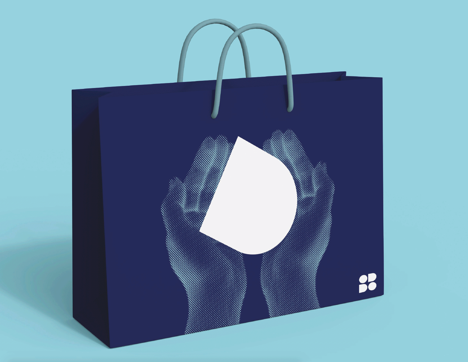
Identity and naming proposition for OD DO INTEGRACIJE (IT experts that integrate big software solutions to fully developed companies) where we propose shortening the name and making the halftone as a main graphic expression where we have raster dots made of letters O and D.
Identity and naming proposition for OD DO INTEGRACIJE (IT experts that integrate big software solutions to fully developed companies) where we propose shortening the name and making the halftone as a main graphic expression where we have raster dots made of letters O and D.
Identity and naming proposition for OD DO INTEGRACIJE (IT experts that integrate big software solutions to fully developed companies) where we propose shortening the name and making the halftone as a main graphic expression where we have raster dots made of letters O and D.
GHETALDUS
GHETALDUS
GHETALDUS
GHETALDUS
GHETALDUS
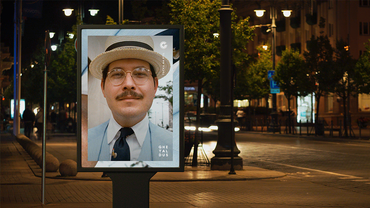
Art direction proposition for Ghetaldus (the biggest Croatian glasses retailer and manufacturer). Inspiration by Charles H. Traub's Lunchtime portraits decided it would be an appropriate aesthetics for a campaign whose main goal is to show the longevity of the Ghetaldus brand in Croatia (64 years). C. H. Traub's photos were used as proposition images for the campaign.
Art direction proposition for Ghetaldus (the biggest Croatian glasses retailer and manufacturer). Inspiration by Charles H. Traub's Lunchtime portraits decided it would be an appropriate aesthetics for a campaign whose main goal is to show the longevity of the Ghetaldus brand in Croatia (64 years). C. H. Traub's photos were used as proposition images for the campaign.
Art direction proposition for Ghetaldus (the biggest Croatian glasses retailer and manufacturer). Inspiration by Charles H. Traub's Lunchtime portraits decided it would be an appropriate aesthetics for a campaign whose main goal is to show the longevity of the Ghetaldus brand in Croatia (64 years). C. H. Traub's photos were used as proposition images for the campaign.
JUDITA
JUDITA
JUDITA
JUDITA
JUDITA
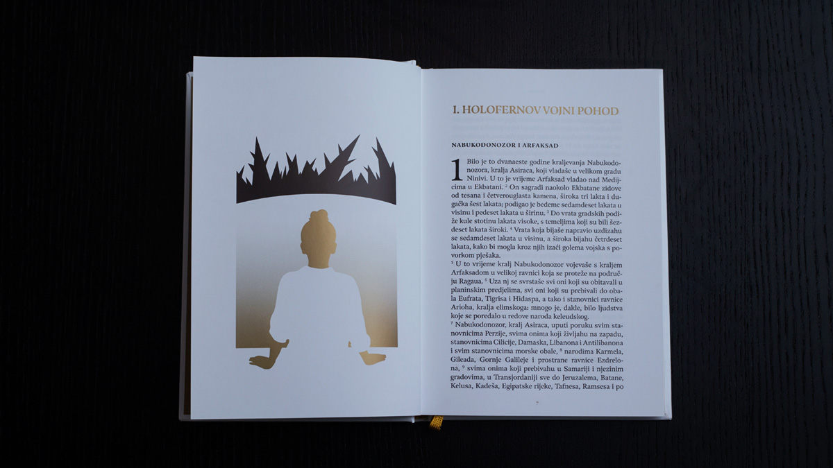
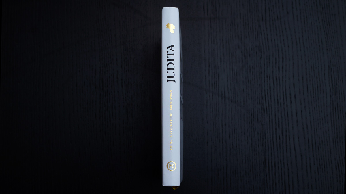
Book design for the 500 year anniversary since the first print edition of Judita (Judith), one of the most important Croatian literary works, an epic poem was written by the "father of Croatian literature" Marko Marulić in 1501. This edition has 3 versions of Judith, from the Bible, the one from Marko Marulić, and the modern version from Miro Gavran.
Book design for the 500 year anniversary since the first print edition of Judita (Judith), one of the most important Croatian literary works, an epic poem was written by the "father of Croatian literature" Marko Marulić in 1501. This edition has 3 versions of Judith, from the Bible, the one from Marko Marulić, and the modern version from Miro Gavran.
Book design for the 500 year anniversary since the first print edition of Judita (Judith), one of the most important Croatian literary works, an epic poem was written by the "father of Croatian literature" Marko Marulić in 1501. This edition has 3 versions of Judith, from the Bible, the one from Marko Marulić, and the modern version from Miro Gavran.


LOGO design and animation
LOGO design and animation
LOGO design and animation
LOGO design and animation
LOGO design and animation


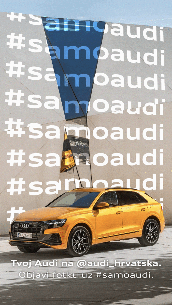
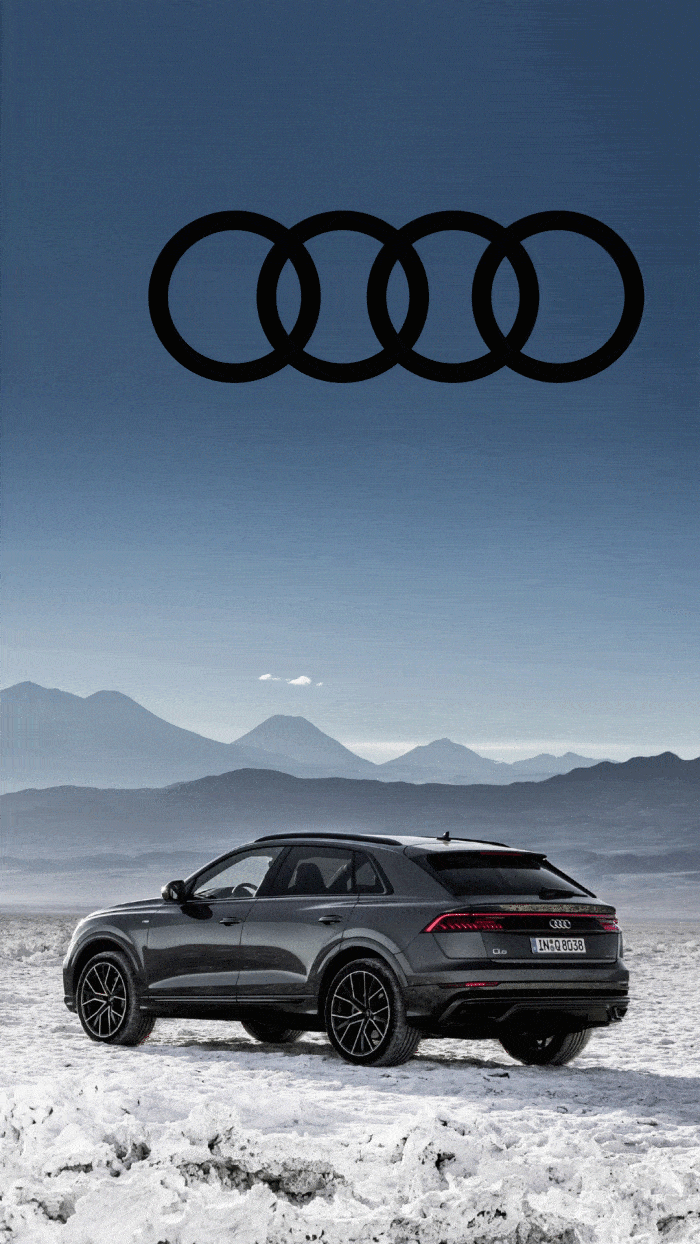
AUDI animated IG stories
AUDI animated IG stories
AUDI animated IG stories
AUDI animated IG stories
AUDI animated IG stories


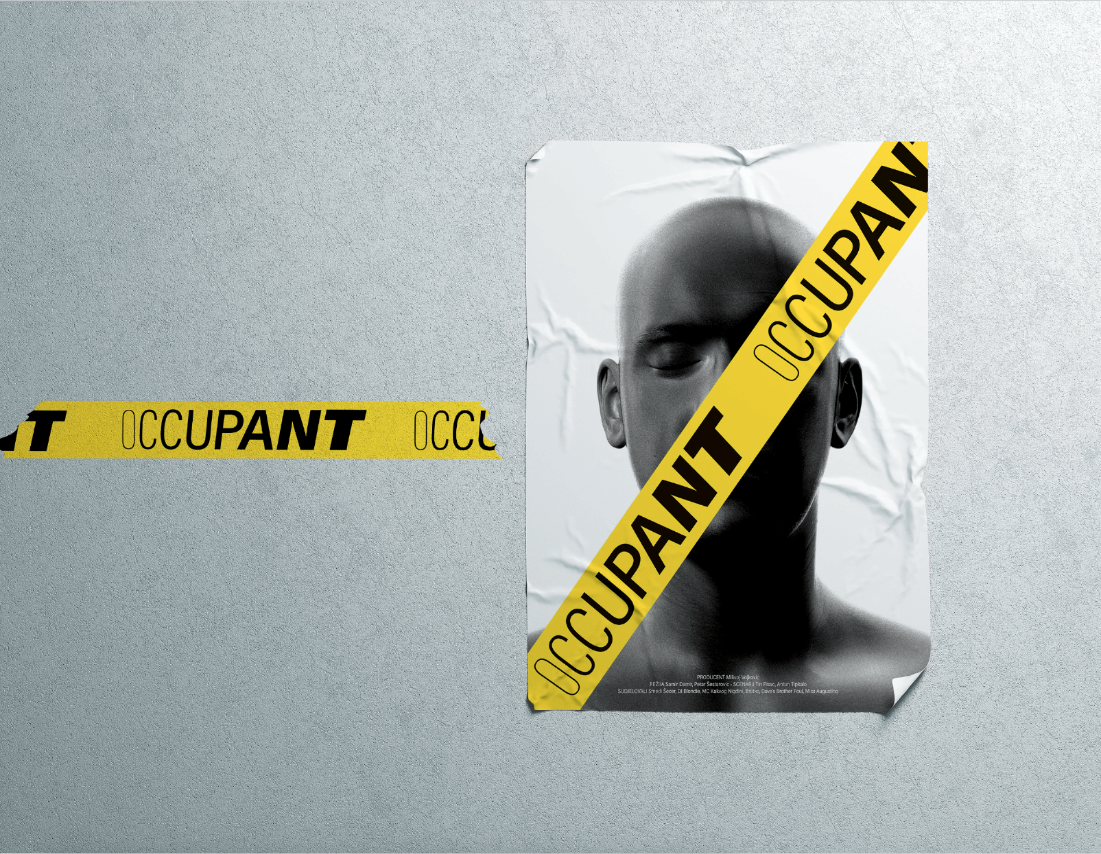
OCCUPANT movie poster
OCCUPANT movie poster
OCCUPANT movie poster
OCCUPANT movie poster
OCCUPANT movie poster
RANDOM
RANDOM
RANDOM
RANDOM
RANDOM
